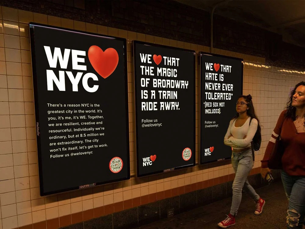
Nearly 50 years after the original “I ❤️ NY” logo debuted, officials are rolling out an updated take on the iconic design. But many New Yorkers—and design professionals—are less than thrilled.
Officials unveiled the new logo—“We ❤️ NYC”—earlier this week as part of a new campaign to inspire civic engagement and volunteerism in the city.
“This city overcame the darkest days of the pandemic because of the selfless work of everyday New Yorkers, and if each of us gives just one hour a week in an act of service, the result will be transformative,” said Mayor Eric Adams in a statement announcing the initiative. “The ‘We ❤️ NYC’ campaign asks everyone who loves the greatest city in the world to show it by lending a helping hand and spreading that love to every block across all five boroughs.”
/https://tf-cmsv2-smithsonianmag-media.s3.amazonaws.com/filer_public/3b/d9/3bd95e38-6767-4393-ab54-bb7c8da59c4a/gettyimages-1248934484.jpg)
The new logo had a rough first 24 hours on the internet, where design professionals and everyday New Yorkers alike immediately started piling on criticism.
“I can’t imagine any person with a background in graphic design made that thing without a committee of bland politicians sanding away its edges until they felt safe enough to unveil that to the public,” Tag Hartman-Simkins, the Brooklyn-based director of design at Futurism.com, tells the New York Times’ Dodai Stewart.
Ben Stephens, a freelance copywriter, tweeted, “The impact of the iconic ‘I❤️NY’ comes from its simplicity, its boldness, the foursquare arrangement of its elements.” Per Gothamist’s Elizabeth Kim, he then added, “The original looks like the voice of a city. The new one looks like the voice of an investment bank or possibly a healthcare provider.” He pointed out how lopsided the design looks, particularly the heart jutting out on the side.
The new logo uses a font adapted from the city’s subway signs, Graham Clifford, the designer who oversaw the new logo’s creation, tells the New York Times’ James Barron.
“The subway system is the veins or the beating heart of the city,” he says, adding that on the subway, “you can have Wall Street types sitting next to construction workers. It’s a place where you can bring everybody together, and we’re cognizant of that.”
The design is meant to live alongside the original “I ❤️ NY” design, not replace it, says Maryam Banikarim, a marketing executive who worked on the campaign, to Hyperallergic’s Taylor Michael. Still, she adds, “This is a moment for we, not I.” The new logo also specifically refers to the city, rather than the state.
Celebrated graphic designer Milton Glaser created the original “I ❤️ NY” logo for the city for free, first drafting it with red crayon on the back of a scrap of paper (some say a napkin, others say an envelope) while riding in the back of a cab. It debuted in the 1970s, when it was used as part of a campaign to attract tourists to New York State during an economic downturn.
“The final logo, set in a rounded slab serif font aptly named American Typewriter, would ultimately become one of the most internationally recognizable icons,” writes Tiffany Lambert for the Cooper Hewitt, Smithsonian Design Museum. “[The logo]helped boost the city from its infamous 1970s image as dark, dirty and dangerous to a popular (and profitable) campaign that New Yorkers and tourists alike could identify with.”
Glaser returned to the simple design after the 9/11 attacks, reimaging the logo with a heart that was slightly blackened in the lower corner, reminiscent of ashes or a char from flame. He changed the text, too: “I ❤️ New York More Than Ever,” the updated poster reads. The design campaign ultimately raised almost $200,000 for charities helping New Yorkers in the wake of the attacks.
Glaser, who died in 2020, isn’t around to see the latest redesign. But Ryan McGinness, a fine artist who incorporates logos into his work, tells the Times what he would have done differently. His version is more symmetrical—and deviates less from the original: He stuck with the typewriter font, and he designed the top three characters (“We ❤️”) to match the width of the bottom three characters (“NYC”).
“It ain’t broke, so don’t fix it,” he tells the Times. “Insteads let’s build upon it.”
Source : SmithsonianMagazine

